BJIDENT Procedure |
@BJIDENT assists in identifying a Box-Jenkins model by computing and graphing the correlations of the series in various differencing combinations.
@BJIDENT( options ) series start end
Parameters
|
series |
series to analyze |
|
start, end |
range for calculations. By default, range of series |
Options
DIFF=maximum regular differencings[0]
SDIFFS=maximum seasonal differencings[0]
TRANS=[NONE]/LOG/ROOT
Transformation to apply to data
SPAN=seasonal span
NUMBER=number of autocorrelations to compute [default depends upon data]
METHOD=YULE/[BURG]
Selects method used to compute correlations (see CORRELATE instruction for details)
REPORT/[NOREPORT]
QSTATS/[NOQSTATS]
REPORT shows a table with the ACF's and PACF's. When used with REPORT, QSTATS includes the Q-statistics in the report. The REPORT and QSTATS tend to be rather uninteresting at this phase of the analysis since it isn't expected that the series will be white noise or anything close to it.
[GRAPH]/NOGRAPH
Do graphs?
SPIKE/[NOSPIKE]
SPIKE selects a "spike" graph, rather than a bar graph, with the regular and partial autocorrelation graphs separated vertically.
SEPARATE/NOSEPARATE [default is NOSEPARATE except when using SPIKE]
Use SEPARATE if you want the correlations and partial correlations plotted as separate graphs (one a single page).
[ZERO]/NOZERO
Display the first correlation
MAX=maximum/minimum value on vertical axis scale [1]
Examples
This does @BJIDENT on a series with strong seasonality, so it includes both the DIFFS=1 and SDIFFS=1 options. This will produce autocorrelation graphs for (0,0), (0,1), (1,0) and (1,1) combinations of regular and seasonal differences.
open data aus_electric.xls
calendar(m) 1980
data(format=xls,org=columns) 1980:1 1995:8 elec
*
graph(header="Figure 7-9 Australian monthly electricity production")
# elec
*
* BJIDENT with both the DIFFS and SDIFFS option will do all combinations
* of 0 or 1 regular and 0 and 1 seasonal differences.
*
@bjident(diffs=1,sdiffs=1,method=burg,number=40) elec
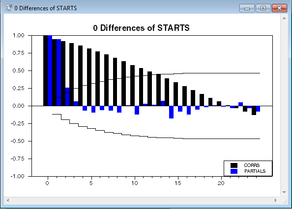
This does @BJIDENT on a series of housing starts. The output is shown below. For illustration, this includes the REPORT and QSTATS options, though there is little useful information in those. It's the graph of the correlations and partial autocorrelations that is most helpful. Here it would tend to show that the series is borderline between needing a difference, or being fit with an AR(2) as it stands.
open data house.dat
cal(m) 1968:1
data(format=prn,org=columns) 1968:1 1996:6
*
graph(key=upright,footer=$
"Figure 10.2. U.S. Housing Starts and Completions, 1968:01-1996:06") 2
# starts
# completions
*
@bjident(number=24,report,qstats) starts 1968:1 1991:12
Sample Output
As mentioned above, the report information generally isn't very useful, since there's no reason to suspect that the series (or any of its differences) will be serially uncorrelated, so the fact that the Q's are huge isn't a surprise.
0 Differences of STARTS
Lag Corr Partial LB Q Q Signif
1 0.940 0.940 256.988 0.000
2 0.913 0.254 500.281 0.000
3 0.886 0.065 730.153 0.000
4 0.850 -0.072 942.502 0.000
5 0.810 -0.096 1136.053 0.000
6 0.770 -0.061 1311.587 0.000
7 0.726 -0.071 1468.086 0.000
8 0.675 -0.099 1604.138 0.000
9 0.633 0.006 1723.939 0.000
10 0.575 -0.127 1823.413 0.000
11 0.531 0.031 1908.316 0.000
12 0.486 0.013 1979.661 0.000
13 0.447 0.072 2040.426 0.000
14 0.388 -0.178 2086.292 0.000
15 0.335 -0.085 2120.682 0.000
16 0.277 -0.123 2144.268 0.000
17 0.219 -0.055 2159.110 0.000
18 0.166 -0.020 2167.642 0.000
19 0.113 0.008 2171.630 0.000
20 0.062 -0.012 2172.842 0.000
21 0.008 -0.037 2172.864 0.000
22 -0.033 0.047 2173.208 0.000
23 -0.084 -0.036 2175.447 0.000
24 -0.132 -0.081 2181.000 0.000
Copyright © 2025 Thomas A. Doan