GBOX Instruction |
GBOX( options ) number hfield vfield
# series start end (one line for each series)
GBOX produces box plots (also known as "box-and-whisker" plots) for one or more series. Box plots provide a simple graphical representation of some of the basic statistical properties of one or more series, including the median, the interquartile range, the maximum and minimum values, and significant outliers.
Wizard
If you generate a series list, you can use the ![]() toolbar to generate a quick box plot from selected series.
toolbar to generate a quick box plot from selected series.
Positioning
When using SPGRAPH to put multiple graphs on a page, RATS normally fills the page by column starting at the top left (field 1,1). To place a graph in specific field, use either the COL and ROW options or the hfield (column) and vfield (row) parameters.
Parameters
|
number |
number of series to graph. There is no actual maximum, though the graphs are almost unreadable above 10. |
|
hfield vfield |
See “Positioning” above |
Supplementary Cards
Use one supplementary card for each series you want to plot.
|
series |
the series to plot |
|
start, end |
(Optional) the range to use in generating the box plot. If you have not set a SMPL, this defaults to the defined range of series. start and end can be different for each series in the graph. |
Options
Most of the GBOX options are the same as those available on the GRAPH instruction. These common options are listed briefly below—see GRAPH for details. The options that are unique to GBOX are described in more detail below.
|
[AXIS]/NOAXIS |
Draw horizontal axis if Y=0 is within graph bounds |
|
COL=column number |
Column position in an SPGRAPH array |
|
EXTEND/[NOEXTEND] |
Extend horizontal grid lines across graph |
|
FOOTER=footer label |
Adds a footer label below graph |
|
FRAME=[FULL]/HALF/NONE/BOTTOM |
Controls frame around the graph |
|
HEADER=string |
Adds a header to the top of the graph |
|
HEIGHT=value |
Sets the height of the graph |
|
HLABEL=label |
Adds a label to the horizontal axis |
|
LOG=value |
Base for log scale graphs |
|
MAX=value |
Value for upper boundary of graph |
|
MIN=value |
Value for lower boundary of graph |
|
PICTURE="picture code" |
Picture code for formatting axis label numbers |
|
ROW=row number |
Row position in an SPGRAPH array |
|
SCALE=[LEFT]/RIGHT/BOTH/NONE |
Placement of vertical scale |
|
SMPL=series or frml |
Series/formula indicating entries to be graphed |
|
SUBHEAD=string |
Subheader string for graph |
|
VGRID=vector |
Values for grid lines across from vertical axis. |
|
VLABEL=label |
Label for the vertical axis |
|
VTICKS=number |
Maximum number of vertical ticks |
|
WIDTH=value |
Sets the width of the graph |
|
WINDOW=string |
Title for graph window |
Options Specific to GBOX
LABELS=VECTOR[STRINGS] of labels for the plots[series names]
By default, GBOX labels the x-axis with the names of the series being plotted. If you prefer, you can provide your own labels using the LABELS option. The first box plot will be labeled with the first string in the vector, the second plot with the second string, and so on.
GROUP=SERIES or FRML with distinct values for each group
You can use this option to have GBOX divide the series being graphed into groups, or subsamples, based on the values of this series or formula. For example, if you supply a 0/1 dummy variable, GBOX will do two plots for each series—one plot using observations where the GROUP series contains zeros, and another for observations where the GROUP series contains ones.
Elements of a Box Plot
Box plots include the following elements:
•A line representing the median value
•A box representing the interquartile range (IQR). The top and bottom lines of the box correspond to the 75th and 25th percentiles, respectively.
•Vertical lines, or “whiskers” indicating (up to) 1.5 times the IQR in either direction from the 75th and 25th percentiles. This is about 2.7 standard deviations on either side of the median for a Normal series. (The whisker will be truncated at the maximum or minimum value if necessary—in the example below, the lower whisker is shorter because of that).
•Short horizontal lines representing the maximum and minimum values.
•Dots representing outliers: values outside the whiskers.
.png)
Example
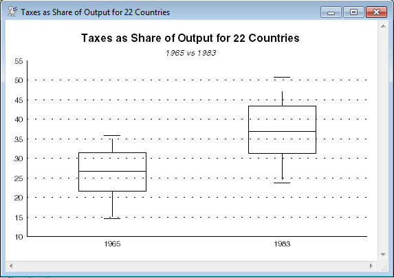
open data CountryTaxData.xlsx
calendar(panelobs=22)
data(format=xlsx,org=columns) 1//1 1//22 country tax1965 tax1983
gbox(header="Taxes as Share of Output for 22 Countries",$
subheader="1965 vs 1983",labels=||"1965","1983"||,$
frame=half,extend) 2
# tax1965
# tax1983
Copyright © 2025 Thomas A. Doan