DBOX Instruction |
DBOX(ACTION=DEFINE)
DBOX(options) output value
DBOX(ACTION=RUN)
DBOX is used to define and execute a dialog box requesting input from the user. A DBOX can include most of the standard dialog box items, such as check boxes, radio buttons, edit text boxes and combo boxes. In addition, you can control whether items are active and inactive, and can verify input before the user is allowed to dismiss the box.
There are several special purpose instructions which allow more limited forms of dialogs: QUERY gets a single piece of information from a “text box”, SELECT presents a scrolling list for selection of one or more items, and MENU and CHOICE combine to offer a set of operations from which the user can select one.
A dialog box is created and executed by a series of DBOX commands, beginning with DBOX(ACTION=DEFINE) and ending with DBOX(ACTION=RUN). Between these, you do one or more DBOX(ACTION=MODIFY) commands with the other options to design your dialog box.
Parameters
|
output value |
For most dialog box elements, output value should be an integer variable, which will contain the current value of that item.
The output value variables can be used as the arguments on VERIFY options, to check that the user has supplied valid input, and on DISABLE options, to enable or disable elements of the dialog based on values currently selected or input by the user.
When the user clicks “OK” to close the dialog box, output value will contain the final value of the dialog box element.
A variable must be declared before it can be used as an output value on the DBOX instruction.
Note that, because these get set during the course of running the dialog, their values can change even if the user eventually cancels the dialog. Use the STATUS option to determine if the user OK’ed the dialog. |
Item Types
There are several types of items you can include within a DBOX. Some of these are shown below (see “Item Type Options” for the full list). To add an item to a dialog, use the corresponding option name together with ACTION=MODIFY (the default choice for ACTION). The samples below generally include only one type of item (although some include an additional Static Text item with descriptive text), but note that a single dialog box can include many items. Below each example, we show the code used to generate the dialog box.
|
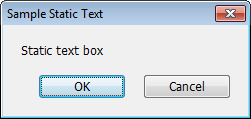
Static text |
A simple text label which can’t be edited.
dbox(action=define,title="Sample Static Text") dbox(stext="Static text box") dbox(action=run) |
|
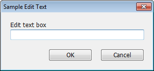
Edit text |
A text box in which the user types information. You can request that this be interpreted as a number or passed back intact as a string. You do that by setting the type of the output value.
declare string result dbox(action=define,title="Sample Edit Text") dbox(stext="Edit text box") dbox(edittext,focus) result dbox(action=run) |
|
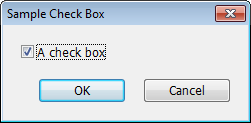
Check box |
A descriptive string attached to a box which shows either on (checked) or off.
declare integer on dbox(action=define,title="Sample Check Box") dbox(checkbox="A check box") on dbox(action=run) |
|
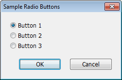
Radio button |
One of a collection of mutually exclusive choices. Such a collection has to be grouped as consecutive items.
declare integer button dbox(action=define,title="Sample Radio Buttons") dbox(radio="Button 1",default=1) button dbox(radio="Button 2") dbox(radio="Button 3") dbox(action=run) |
|
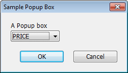
Popup box |
A list of choices which has much the same function as the radio buttons, but with only the selected choice showing when the box is at rest. If you click on it, you have access to the other choices.
declare integer seriesnum dbox(action=define,title="Sample Popup Box") dbox(stext="A Popup box") dbox(popupbox,series) seriesnum dbox(action=run) |
|
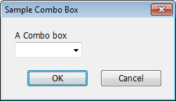
Combo box |
A combination of a text box with a popup box. The user can either type information directly into the text box, or activate the popup and choose one of the choices available there.
declare integer seriesnum dbox(action=define,title="Sample Combo Box") dbox(stext="A Combo box") dbox(combobox,series) seriesnum dbox(action=run) |
|
Scroll box |
A list of choices in a scrolling box. If output value is an INTEGER, only a single selection is allowed, so it would function much like a Popup box, but with more of the choices visible at any one time. If output value is a VECT[INTEGER], the user can select any number of the choices from zero up to all.
declare rectangular[integer] selected dbox(action=define,title="Sample Scroll Box") dbox(stext="A Scroll box") dbox(scrollbox,series) selected dbox(action=run) |

General Options
ACTION=DEFINE/[MODIFY]/RUN
As mentioned above, you start with ACTION=DEFINE and end with ACTION=RUN. Since ACTION=MODIFY is the default, you can omit the ACTION option for anything but the "define" and "run" steps.
TITLE="dialog title" (only with ACTION=DEFINE) [“User Dialog”]
This provides the title at the top of the dialog.
STATUS=integer variable set to 0,1 status (only with ACTION=RUN)
If the user cancels, the status variable is set to zero, and if OK, it’s set to one. You should always include a STATUS option.
DEFAULT=default (integer) value [see below]
DEFAULT specifies the initial value for a checkbox, radio button, or popup box. The defaults are “off” (zero) for checkboxes, and first (1) for radio buttons or popup boxes.
WIDTH=number of character positions[see below]
HEIGHT=number of items to show [see below]
WIDTH specifies the width (in number of character positions) for the item. This defaults to 30 characters for Edit Text and Combo Box items, and to the width of the string (or set of strings) for other items. HEIGHT allows you to set the number of items to show in a SCROLLBOX. By default, this will be 20 or the total number of items available, whichever is smaller.
SPECIAL=SAMELINE/GAP [not used]
SPECIAL=SAMELINE puts the item at the same vertical position as the previous one, just over to the right. This is commonly used for a Static Text item (for a prompt) followed by an Edit Box. SPECIAL=GAP inserts an extra spacing gap before the item.
FOCUS/[FOCUS]
Use FOCUS to indicate that the current item is to be the one which receives the initial focus when the dialog box is displayed.
INITIALIZE/[NOINITIALIZE]
For an edit text item, this indicates whether the value already in the output value variable should be used to initialize the text field. If not, it starts out blank.
OPTIONAL/[NOOPTIONAL]
This applies to the EDITTEXT and COMBOBOX items. If OPTIONAL, the field can be left blank. If it is blank, the output value will be %NA for a real, 0 for an integer, and an empty string for a label or string variable.
VERIFY=expression to verify data[no check]
DISABLE=expression to disable an item [not used]
VERIFY allows you to verify the input data. You supply an expression which should evaluate to a non-zero value if the input data are acceptable. DISABLE disables items in the dialog box—supply an expression which evaluates to a non-zero value if you want an item to be disabled.
SERIES
STRINGS=VECTOR of STRINGS to list
LIST=VECTOR of INTEGERS to list
REGRESSORS
When creating a Popup, Combo, or Scroll Box, use one of these four options to set the list to be displayed.
•Use SERIES to request a selection from the list of series currently in memory. The output values will be the selected series numbers. Note that the special series CONSTANT is never displayed as one of the series in the list.
•Use STRINGS to request a selection from a list of labels.
•Use the LIST option to request a selection from an arbitrary list of integers.
•Use the REGRESSORS option to request a selection of regressors from the last completed regression. The return values are the selected positions in the list.
Item Type Options
One and only one of the following should be used on any DBOX with the default ACTION=MODIFY. Some of the types have related options—these are described below with their respective type options.
STEXT=text for static text item (label)
CHECKBOX=text of the checkbox item
The output value parameter should be an INTEGER variable. Its value will be zero (not checked) or one (checked).
RADIO=text of a radio button item
The set of items which will be treated as a group of radio buttons must be consecutive. The first (and only the first) in the group has the output value parameter. For input (DEFAULT option) and output value purposes, the radio buttons are numbered from 1 to the number in the group.
EDITTEXT
output value can be a scalar variable of any type. If you use the INITIALIZE option, the text field will be initialized with the value in that variable at the time the DBOX is executed. You can use the WIDTH option to restrict the width of the text box. For instance, if you’re expecting an integer value no larger than 99, you can include WIDTH=2.
SPINBUTTON
LOWERLIMIT=lower limit on spin values
UPPERLIMIT=upper limit on spin values
DATE/[NODATE]
SPINBUTTON must follow immediately after an EDITTEXT item. It does not have its own output value. Instead, it adds a spin button (or up-down control) to the preceding EDITTEXT, which allows the user to make minor adjustments to the text box without retyping. You can provide LOWERLIMIT and/or UPPERLIMIT to prevent the user from moving the value outside of that range. If you use DATE, the information will be displayed in date format, though the output value will still be an integer.
POPUPBOX
SCROLLBOX
COMBOBOX
The set of strings for any of these comes from one of the SERIES, STRINGS, LIST and REGRESSORS options described above.
For a COMBOBOX, output value can be a scalar variable of any type, which is filled with the value obtained by processing the text field.
For POPUPBOX and SCROLLBOX, the values returned depend upon which option was used to fill the box:
|
SERIES |
the series number |
|
STRINGS |
the index in the array (1,...,n) |
|
REGRESSORS |
the index into the list of regressors (1,...,number of regressors) |
|
LIST |
the values of the integers |
For POPUPBOX, the DEFAULT option can be used to set which of the choices will be selected initially. By default, it will be the first. For POPUPBOX, output value is an INTEGER.
For SCROLLBOX, output value can be either an INTEGER or a VECTOR of INTEGERS. If the latter, the user can select any number of items in the list, from 0 to all, and the VECT[INT] will be filled with the values of the selections. (If none are selected, it will have 0 rows). You can use the HEIGHT option to control the number of items displayed at one time in the scroll box. If the scroll box is the main element of the dialog box, the default of 20 is probably fine, but if it’s less important, you might want to make the box smaller by setting the limit lower than that.
MATRIX
PICTURE="picture code for data" [none]
VLABELS=VECTOR of STRINGS for row labels
HLABELS=VECTOR of STRINGS for column labels
With MATRIX, output value is a real-valued matrix (must already be dimensioned). It can be used to request input of numerical information from the user or, with MSELECT, to have the user select rows or columns based on the displayed values. PICTURE chooses a picture code for formatting the numbers.
MSELECT=ROWS/ONE/BYROW/BYCOL
SELECT=VECTOR[INTEGER] of selections
If you use the MSELECT option (with MATRIX), DBOX will display the data, and the user can select items from the matrix. When the window is closed, the VECTOR[INTEGER] that you provide with the option SELECT will be filled with information regarding the selection, as described below.
You use SELECT to control how selections are made. With MSELECT=ROWS, the user can select one or more rows. The array provided using the SELECT option will have dimension equal to the number of selections made, and will list the rows selected using numbers 1,...,n. If MSELECT=ONE, it will have dimension 2 with array(1)=row and array(2)=column. If MSELECT=BYROW, the user selects one cell per row. The SELECT array will have dimension equal to the number of rows, with array(i) set equal to the column selected in row i. MSELECT=BYCOL is similar, but one cell per column is selected.
Copyright © 2026 Thomas A. Doan