|
Examples / GRAPHOVERLAY.RPF |
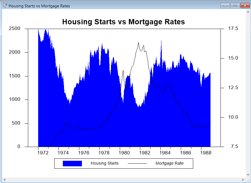
GRAPHOVERLAY.RPF is an example of an overlay (two-scale) graph. It also demonstrates the use of the SHADING option to highlight certain parts of the graph range.
The data consist of monthly data on mortgage rates (FCME) and housing starts (HST). An overlay graph is created with the housing starts as the left axis value (it's listed first) with STYLE=POLYGONAL, and mortgage rates as the right axis value with style OVERLAY=LINE.
graph(key=below,header="Housing Starts vs Mortgage Rates",$
klabel=||"Housing Starts","Mortgage Rate"||,style=polygonal,min=0.0,overlay=line) 2
# hst / 2
# fcme / 1
You may need to experiment to get a reasonable combination of colors or shades. If you use a "painted" style like POLYGONAL, you need to do that as the right axis series so it is drawn first. This paints blue (fill color style 2) with a black line (line color style 1) for the overlay line.
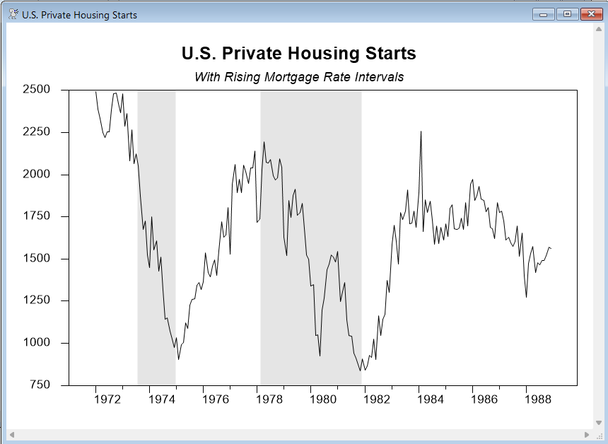
The second graph does a line graph of the housing starts with shading over two periods which were marked by rising mortgage rates (which would be expected to reduce housing starts). The two zones were 1973:8 through 1974:12 and 1978:3 through 1981:11.
set raterise = (t>=1973:8.and.t<=1974:12).or.(t>=1978:3.and.t<=1981:11)
graph(shading=raterise,header="U.S. Private Housing Starts",$
subheader="With Rising Mortgage Rate Intervals") 1
# hst
Full Program
open data haversample.rat
calendar(m) 1972
data(format=rats) 1972:1 1988:12 fcme hst
graph(key=below,header="Housing Starts vs Mortgage Rates",$
klabel=||"Housing Starts","Mortgage Rate"||,style=polygonal,min=0.0,overlay=line) 2
# hst / 2
# fcme / 1
*
set raterise = (t>=1973:8.and.t<=1974:12).or.(t>=1978:3.and.t<=1981:11)
graph(shading=raterise,header="U.S. Private Housing Starts",$
subheader="With Rising Mortgage Rate Intervals") 1
# hst
Graphs
Copyright © 2026 Thomas A. Doan