|
Wizards / Scatter Graph Wizard |
Selecting Scatter (X-Y) Graph from the Data/Graphics menu brings up the following dialog box, which allows you to generate scatter plots:
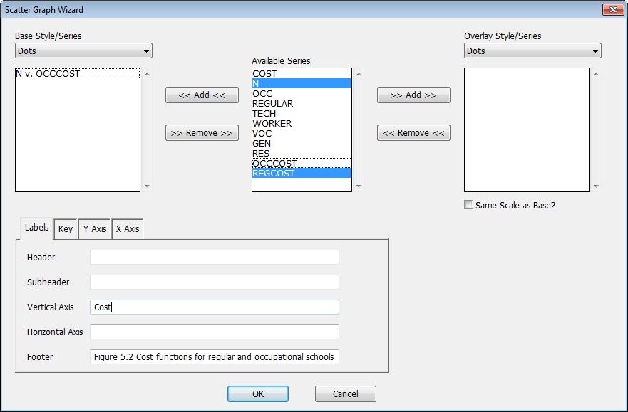
Use the fields described below to choose the series you want to graph, select the style of the graph, and add any labeling. Clicking OK will generate the corresponding SCATTER instruction (and execute it, if the "Paste and Execute" switch is turned on).
Note that the SCATTER instruction offers many more options than are available using the Wizard. You may find it useful to use the Wizard to generate the basic SCATTER command, and then add additional options as desired.
Available Series, Base Series, Overlay Series
The Available Series list in the middle of the dialog box shows all the series in memory. To generate a scatter plot, select (highlight) two series from this list and click on the Add button on the left of the list. RATS will prompt you with another dialog box asking you indicate which series to associate with the X- and Y-axes, respectively. Here, we've already put N (as X) vs OCCCOST (as Y) in the list, and have selected N and REGCOST as the next pair to be added.
You can repeat this operation with additional pairs of series if you want to plot multiple pairs on the same graph. If you want to add additional pairs that will be graphed using a separate scale or a different style (what we call an "overlay" graph), select those series from the Available Series list and click on the Add button to the right. Those series will be added to the Overlay Series list.
Base Style
Overlay Style
The Base Style and Overlay Style drop down lists selects the style to be used for the "base" and (optional) overlay series pairs. The style on the left of the dialog box applies to the Base Series list, while the box on the right applies to the Overlay Series (if any). These correspond to the STYLE and OVERLAY options on the SCATTER instruction.
Label Tab
The main tab at the bottom of the dialog controls the main set of outer labels. Here, we've put labels into the Vertical Axis and Footer fields. The five label fields and what they do are:
|
Header |
Header at the top of the graph, creates a HEADER option |
|
Subheader |
Subheader (immediately below the header at the top). Creates a SUBHEADER option. |
|
Vertical Axis |
Creates a label for the vertical (y) axis, usually displayed on the left. Creates a VLABEL option. |
|
Horizontal Axis |
Creates a label for the horizontal (x) axis, usually displayed below the graph box. Creates an HLABEL option. |
|
Footer |
Creates a label for the graph at the bottom left corner. Creates a FOOTER option. |
Key Tab
If you switch the tab at the bottom to "Key", you'll see something like:
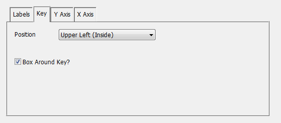
Position
Controls the placement of the key (which can be either outside or inside the graph box). By default, it's outside below. This has chosen upper left inside. This generates a KEY option.
Box Around Key?
Controls whether there is a box around the key or not. This (if clicked off) generates a NOKBOX option.
Y Axis Tab
If you switch the tab at the bottom to "Y Axis", you will get something like:
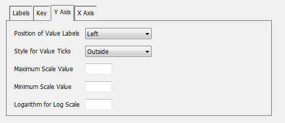
Use these fields to control the appearance and scale of the vertical axis (axes).
X Axis Tab
If you switch the tab at the bottom to "X Axis", you will get something like:
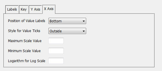
Use these fields to control the appearance and scale of the horizontal axis (axes).
Copyright © 2026 Thomas A. Doan